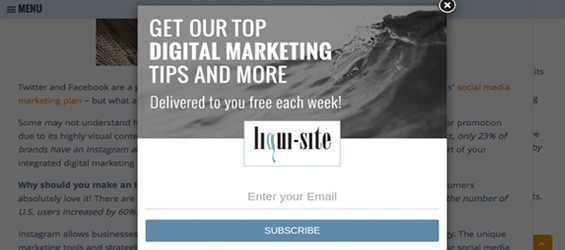

Hearing the word “popup” might have made Internet users cringe in the past, but the truth is, popups work! They’re proven to be extremely effective when it comes to making announcements, asking questions or driving traffic to a specific page on your site.
The most common and successful way that popups are used is to build email subscriber lists. Email marketing is an important component of your digital marketing strategy, so increasing the number of quality subscribers will result in repeat customers and converting prospects into clients.
With popups comes a dark side, of course. Most people will say that they find popups very annoying and that if one shows up on a webpage, they will immediately exit. This is why it’s so important to make sure that when you add a popup to your website, you do not degrade or distract from the visitor experience.
Here are a few things to consider when making popups / pop-ins work for you:
Timing
Timing is everything. Avoid making your pop-in appear as soon as a visitor gets on your site – instead try out different time-based tactics to better engage your visitors. Present a pop-in after a predetermined amount of time, or after a visitor scrolls past a specific amount of content. If these visitors are already interested in your site, they are more likely to comply with a box asking them for an email address for a valuable exchange of information or incentive.
Call To Action & Message
In order to be as effective as possible, your pop-in needs to have the right message. Implement a call to action that is clear, simple and compelling. Give your visitors a good reason to fill out the form.
Clear Design
Make sure the design of your popup matches the rest of your branding. If the design is inconsistent, visitors might think that the popup is spam, become wary, and exit from the site altogether. Also, make sure there is a clear option to exit out of your pop-in window.
Don’t Ask For Too Much
The less work your site visitor has to do, the better. If you want your visitors to fill out a form, ask for as little information as possible. Your site users do not want to spend too much time filling out information and have their experience completely interrupted.
Don’t Be Too Intrusive
One way to implement a popup without totally interrupting the user experience is by adding a “pop-out” to your site. This type of popup sticks out of the side of the browser, but still allows the site visitor to scroll through your website.
Use It As A Last Attempt
An exit-intent popup shows only up when a visitor is about to leave your site. You can use cursor tracking to sense when someone is about to close out or click back. They’re leaving your site either way, so a popup won’t hurt – and it might even draw them back to your site. You can also do this with abandoned shopping carts or any unfinished forms throughout the site.
As much as people claim to hate popups, the truth is that they respond to them. As long as you use tactics that are not annoying, implementing popup/pop-in windows on your website can be extremely effective.
Consult our dedicated digital team on how you can integrate popups on your custom website. For more information about our services, comment below or contact us directly!

